Introduction
Step into the world of color psychology in interior design, where subtle hues and vibrant tones come together to create unique atmospheres that influence our emotions.
As homeowners, understanding how colors impact our moods can help us craft spaces that foster relaxation, productivity, or socialization. In this blog post, we’ll delve into the science behind color psychology and its essential role in crafting exceptional interiors that suit your needs perfectly.
Key Takeaways
- Understanding color psychology is key to creating intentional environments tailored specifically towards fulfilling particular needs or desires within your home.
- Different colors can evoke different emotions and moods, so it’s important to consider the purpose of a room when selecting color schemes.
- Using colors strategically can help set the mood of a space; warm tones are great for creating energy and excitement while cool tones promote relaxation and calmness. Neutral colors provide versatility.
- Incorporating texture into interior design adds depth and dimension to a space, making it more visually interesting. Mixing textures creates visual interest that highlights décor scheme in unexpected ways, giving added warmth and comfort to the home.
The Power Of Color In Interior Design
Understanding color psychology is key to unleashing the power of color in interior design because different hues can evoke various emotions and feelings, which ultimately impact how people perceive a space.
Understanding Color Psychology
 Understanding color psychology is vital for homeowners who wish to create specific atmospheres and trigger certain emotions within their living spaces. In essence, color psychology explores the connection between human emotions and various hues, enabling interior designers as well as DIY enthusiasts to make informed decisions when selecting shades for different rooms.
The emotional impact of colors can be attributed to individual experiences, cultural influences, and even universal associations that have been ingrained throughout history.
Taking note of these factors allows homeowners to design spaces that cater not only to their personal preferences but also those of potential future occupants or visitors.
In sum, understanding color psychology equips you with the tools necessary to create intentional environments tailored specifically towards fulfilling particular needs or desires within your home.
The Emotional Impact Of Colors
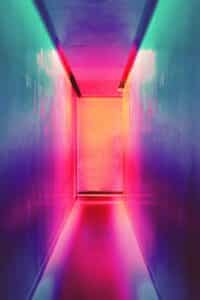
The emotional impact of colors in interior design plays a significant role in creating the overall atmosphere and mood within a space. Color psychology suggests that our feelings, thoughts, and behaviors can be influenced by the hues surrounding us.
For example, warm colors like red, orange, and yellow tend to evoke emotions such as excitement, energy, and stimulation.
On the other hand, cool colors such as blue and green often create a sense of calmness, tranquility, and relaxation. Integrating these soothing tones into more private spaces like bedrooms or bathrooms can promote restful sleep or provide a peaceful retreat from daily stressors.
Furthermore, neutral colors like grey offer a sense of stability and balance throughout your home while allowing focal points or pops of color to shine through for visual intrigue.
Cultural And Personal Preferences
Cultural and personal preferences play a significant role in the application of color psychology in interior design. As colors hold different meanings across various cultures, it’s essential to consider these factors when choosing hues for your home.
Taking into account individual tastes is also crucial when selecting color schemes because individual associations with colors can greatly impact how a person perceives a space.
For example, someone who had positive memories associated with the color yellow might find that incorporating pops of yellow into their living room brings joy and warmth to the space.
On the other hand, if an individual associates blue with feelings of sadness or isolation due to past experiences, they may feel more comfortable opting for warmer tones like reds or oranges instead.
Applying Color Psychology In Interior Design
Choose colors that evoke the desired emotions and create a cohesive color scheme throughout the space to enhance the overall atmosphere.
Choosing The Right Colors For Each Space
Choosing the right colors for each space in your home is essential in creating a cohesive and inviting atmosphere. Here are some tips to help you choose the perfect color scheme:
- Consider the purpose of the room: Different colors can evoke different emotions and moods, so it’s important to consider how you want people to feel when they enter the room. For example, if it’s a bedroom, you may want to choose calming colors like blue or green.
- Think about natural light: The amount of natural light that enters the room can affect how colors appear on the walls. If the room has plenty of natural light, you may want to consider lighter shades of paint or wallpaper.
- Consider existing furniture: When choosing paint or wallpaper colors, it’s important to think about existing furniture in the room. You don’t want to choose a color that clashes with your favorite sofa or rug.
- Use color theory: Using complementary colors (colors opposite each other on the color wheel) can create a striking effect in a room. Analogous colors (colors next to each other on the color wheel) can create a more harmonious look.
- Experiment with accent walls: An accent wall is a great way to add a pop of color without overwhelming the space. Choose a bold or vibrant color for one wall while keeping others neutral.
- Don’t forget about trim and ceiling: Choosing complementary colors for trim and ceiling can help tie together all aspects of the room’s design.
By following these tips and considering important factors like purpose, lighting, and existing furniture, you’ll be able to choose the perfect color scheme for each space in your home. With just a simple coat of paint or new wallpaper, you’ll be amazed at how easily you can transform any room into an inviting oasis!
Creating A Cohesive Color Scheme
Creating a cohesive color scheme is essential for achieving an aesthetically pleasing and harmonious interior design. It involves selecting colors that complement each other and work together to create a unified look throughout the space.
A good starting point is choosing a dominant color, which will be used as the primary hue in the room, then adding coordinating accent colors to enhance the overall design scheme.
The right combination of colors can make all the difference when it comes to creating a cohesive effect in your home decor. Not only does this add visual appeal but also creates an atmosphere that resonates with occupants’ emotions since various hues have specific psychological effects on people’s moods and perceptions about their surroundings.
By using complementary tones like warm colors such as reds or yellows with cool blues or greens, you can evoke feelings of warmth or serenity depending on how much intensity each shade has within its spectrum.
Using Color To Set The Mood
 Color is a powerful tool in interior design, and using it strategically can help to set the mood of a space. Warm colors like red, orange, and yellow are great for creating energy and excitement in entertainment areas such as living rooms or game rooms.
On the other hand, cool colors like blue and green can promote relaxation and calmness in bedrooms or bathrooms.
It’s important to remember that different shades of each color have varying effects on mood as well. For example, light green can promote feelings of tranquility while dark green can be associated with wealth and success.
Enhancing Interior Design With Texture
– Adding depth and dimension to a space can be achieved through the use of various textures such as soft fabrics, sleek metals, and natural wood.
Adding Depth And Dimension To A Space
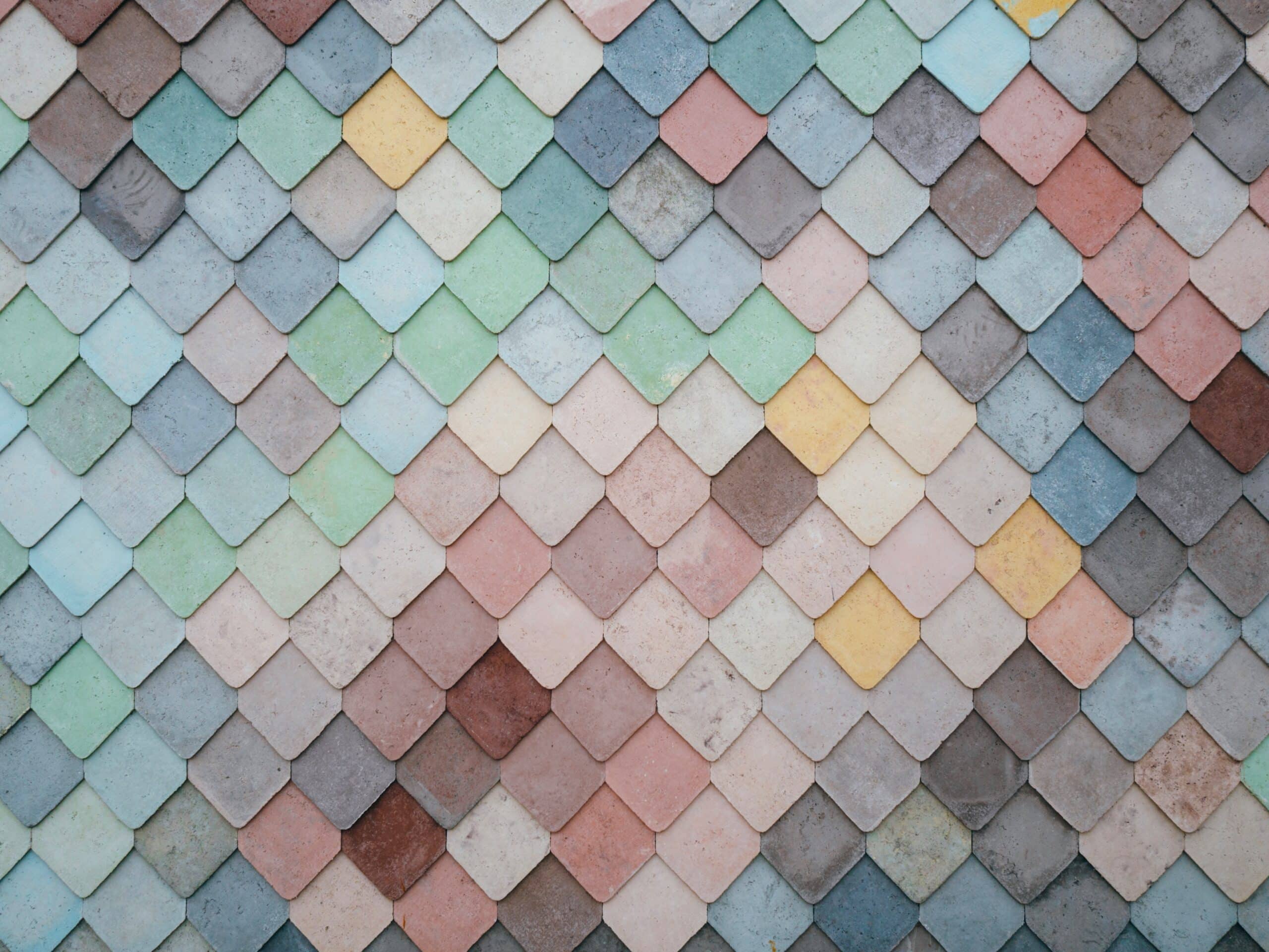
Incorporating texture into your interior design can add depth and dimension to a space. Texture refers to the surface characteristics of materials such as fabric, wood, or stone that create interest and tactile variation in a room.
It can range from soft and plushy textures like shaggy rugs to rough and gritty surfaces like exposed brick walls. Adding texture is an efficient way to bring life into any room without overwhelming it with color.
A simple example would be combining fluffy throw pillows with a sleek leather couch for some contrasting textures or layering area rugs of different patterns to give an illusion of more space.
Combining Colors And Textures
One way to enhance the interior design of your home is by combining colors and textures. Using different textures add depth and dimension to a space, making it more visually interesting.
You can mix and match contrasting textures such as velvet and rough linen for a unique look, or layer similar textures like silk and satin for a cohesive feel.
In addition, you can play with color combinations to create an eye-catching design scheme.
Another way to use texture in your interior design is through patterns and prints which adds visual interest when combined with appropriate background tones.
By considering color psychology in your interior design choices together with careful selection and blending of complimentary textures will ensure that each space has its own distinct personality while still maintaining harmony throughout your home.
Using Patterns And Prints
Patterns and prints are a great way to add interest and personality to your interior design. They can be used in many different ways, from bold wallpaper to subtle accents like throw pillows or curtains.
Combining patterns can create a lively and visually stimulating space, but it’s important to choose complementary colors and designs that work well together.
When using patterns and prints, it’s important to also consider the scale of each element. A large pattern might overwhelm a small room, while a smaller print might get lost in a larger space.
The use of patterns can also help evoke certain moods or styles; for instance, an intricate paisley might add some bohemian flair to your living room decor, while sleek geometric lines could bring some modern sophistication into your bedroom.
Designing For Specific Spaces And Purposes
When designing a bedroom, it’s important to use calming colors like light blues and greens to promote relaxation and restful sleep.
Bedrooms And Relaxation
The bedroom is a place of rest and relaxation, and the colors selected for this space should reflect this. Soft, muted tones such as light blues, greens, and greys are great options for creating a soothing atmosphere in your bedroom.
These cool colors can evoke feelings of calmness and tranquility while helping to relieve stress after a long day. For those who prefer warm colors like oranges or reds, consider using them sparingly as pops of color in accent pieces or bedding instead of on the walls where they may be too stimulating for sleep.
Using soft tones such as light blues, greens, and greys can create a calming atmosphere in the bedroom. Warm colors should be used sparingly in accents rather than on walls to avoid over-stimulating emotions that could interfere with sleep.
Living Rooms And Entertainment
The living room is often the hub of activity in a home, where people gather to relax and socialize. When choosing colors for this space, it’s important to consider the mood you want to create.
Warm colors like reds, oranges, and yellows can stimulate conversation and energy, while cool blues and greens promote relaxation.
In addition to color selection, consider the layout of your furniture in the living room. Arrange seating areas around a central focal point like a fireplace or TV for optimal entertainment options.
Don’t forget about lighting – use table lamps or floor lamps to create soft ambient light during movie nights or dimmer switches for more intimate gatherings.
Home Offices And Productivity
Designing a home office that promotes productivity is essential for people who work remotely or run their own businesses. Color psychology plays a major role in creating an environment that fosters concentration, innovation, and efficiency.
A good color to use in a home office is yellow, as it stimulates creativity and optimism while keeping you alert and focused. Blue also works wonders in promoting focus and relaxation, making it perfect for those long workdays where you need to keep your mind sharp but stay calm at the same time.
For added inspiration, pops of green create a sense of balance and refreshment throughout the day – especially effective if you’re working with plants or outdoorsy elements like wood furniture or natural light sources.
Bathrooms And Tranquility
Bathrooms are one of the most private spaces in a home, where we often look for calm and relaxation after a busy day. To create a tranquil bathroom, it’s essential to choose colors that evoke feelings of serenity and peace.
Soft shades of blue or green can create a spa-like atmosphere, while neutral tones like beige or gray can add warmth and depth without overwhelming the space.
To further promote relaxation, consider adding touches of nature through plants or botanical prints. Soft lighting fixtures like dimmer switches or candles can also make your bathroom feel more welcoming and peaceful.
Conclusion And Final Thoughts
In conclusion, understanding color psychology in interior design is a powerful tool for creating your dream space. By choosing the right colors and textures, you can evoke specific emotions and set the mood of a room to suit any purpose or occasion.
Whether you prefer warm hues like red and yellow or calming shades of green and blue, there are endless possibilities for designing a space that reflects your unique personality and style.
FAQs:
Q: What is color psychology in interior design?
A: Color psychology is the study of how various colors can impact a person’s emotions, behavior, and mood. In interior design, color psychology is the application of these principles to create a specific atmosphere or mood within a space.
Q: How can different hues evoke different moods in interior design?
A: Different hues can evoke different moods due to their psychological effects on individuals. For example, warm hues such as red, orange, and yellow tend to be more energizing and stimulating, while cooler hues such as blue and green have a calming and relaxing effect.
Q: How important is color for interior design?
A: Color is an essential element of interior design as it can drastically transform the look and feel of a space. The right colors can set the tone of a room, create a cohesive design, and evoke a particular mood or emotion.
Q: What are some design trends related to interior design color psychology?
A: Some current design trends related to interior design color psychology include the use of bold, rich colors such as regal purples or deep emerald greens, mixing and matching colors to create a vibrant color palette, and using white as a neutral base to make other colors pop.
Q: How do specific colors affect our subconscious in interior design?
A: Specific colors can affect our subconscious in different ways. For example, red is considered a powerful interior design tool as it can stimulate the senses and increase energy levels. Blue, on the other hand, is thought to be a calming color that can promote tranquility and relaxation.
Q: How should one choose colors for interior design?
A: Choosing colors for interior design should be based on the effect you want to create in the space. Consider the room’s purpose, natural lighting, and existing decor when selecting a color palette. You can also look to the psychology of colors in interior design to guide your choices.
Q: How versatile is the color green in interior design?
A: Green is an incredibly versatile color in interior design as it can evoke a range of emotions and moods depending on the shade and intensity. Lighter shades of green can be calming and soothing, while brighter shades can invigorate and energize a space.
Q: How do paint colors impact the design of a room?
A: Paint colors can have a significant impact on the design of a room. They can create a sense of depth or height, make the room appear larger or smaller, and enhance or detract from the room’s natural lighting.
Q: How does the color pink affect our mood in interior design?
A: Pink is often associated with feelings of warmth, nurturing, and comfort. It can evoke a sense of playfulness and whimsy and is sometimes used in interior design to create a romantic or feminine ambiance.
Q: How powerful of a tool is color in interior design?
A: Color is a powerful design tool that can impact a person’s mood, behavior, and perception of a space. Utilizing specific colors in a space can help to create a cohesive design, set a specific tone, or create a desired ambiance.
